Turning blandness into creativity
Don’t Waste Today Mobile App Redesign


Previous app Design
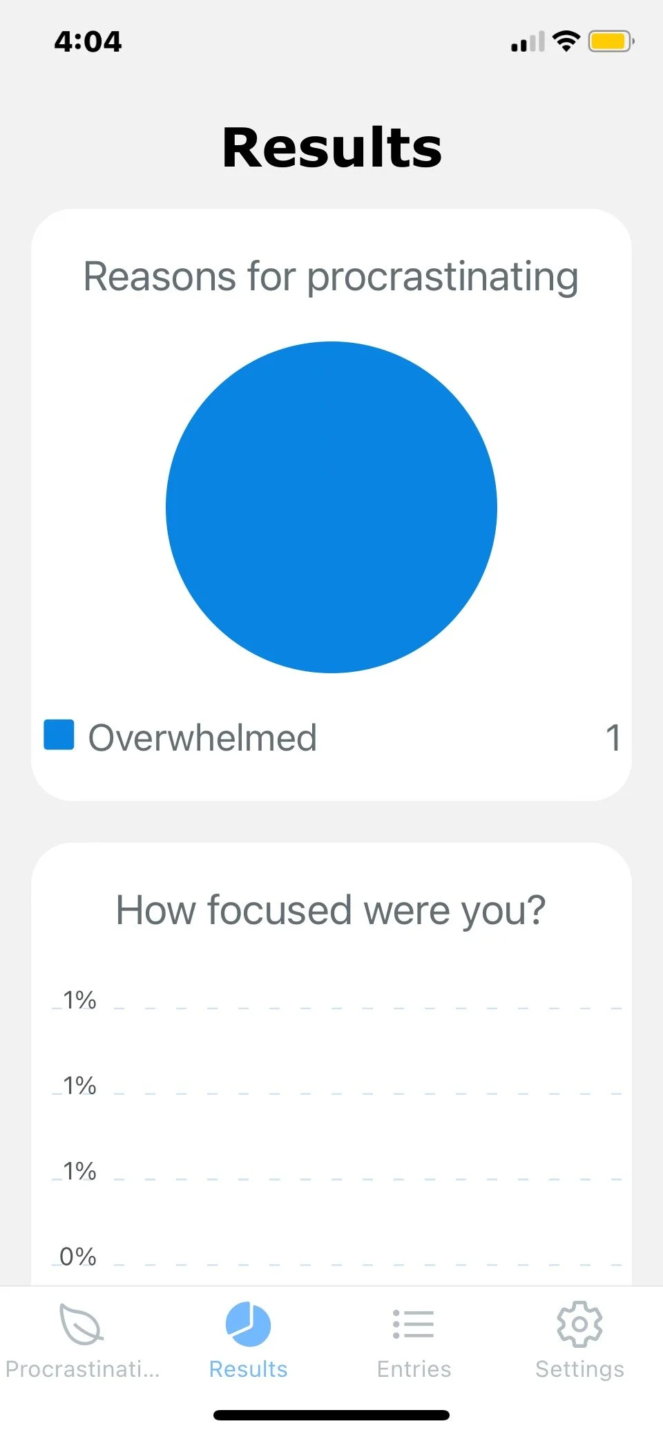
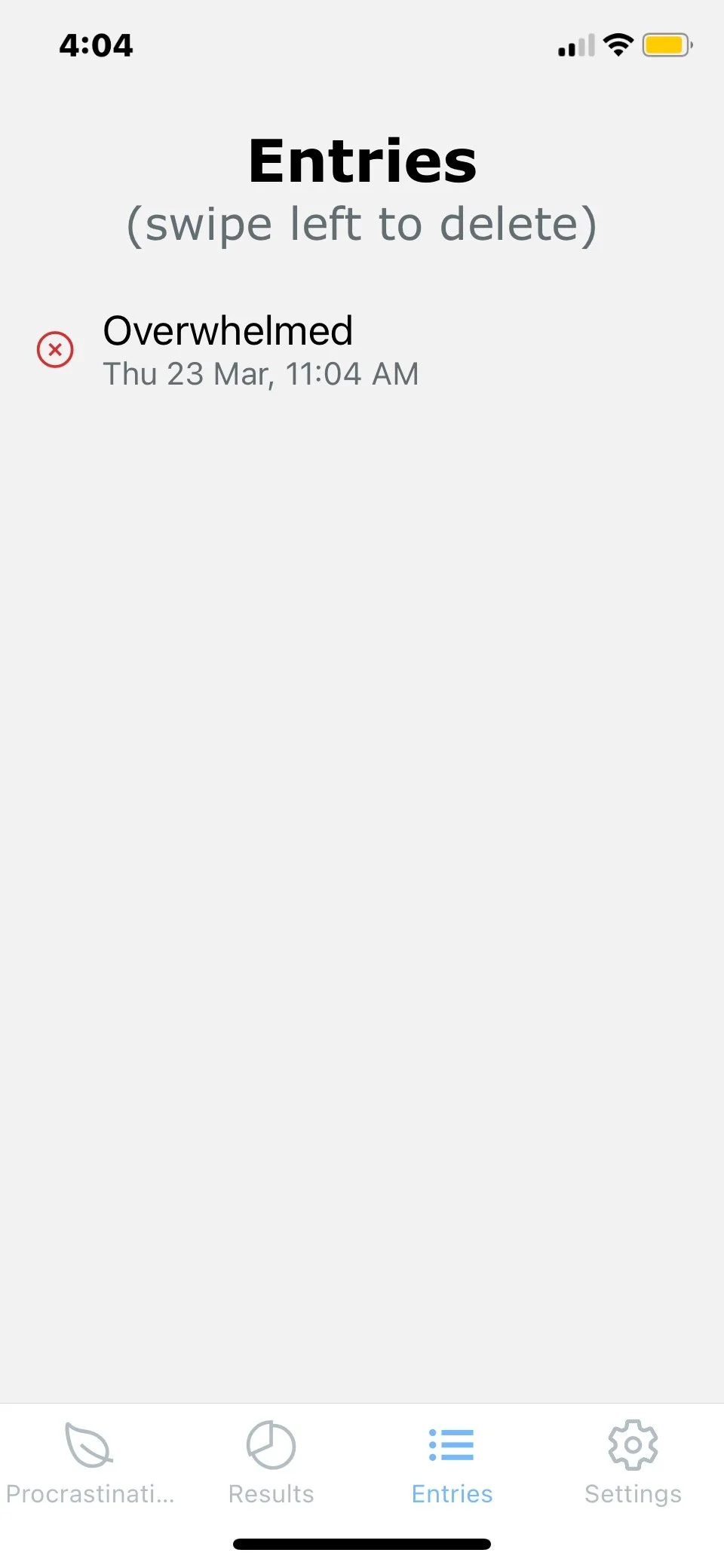
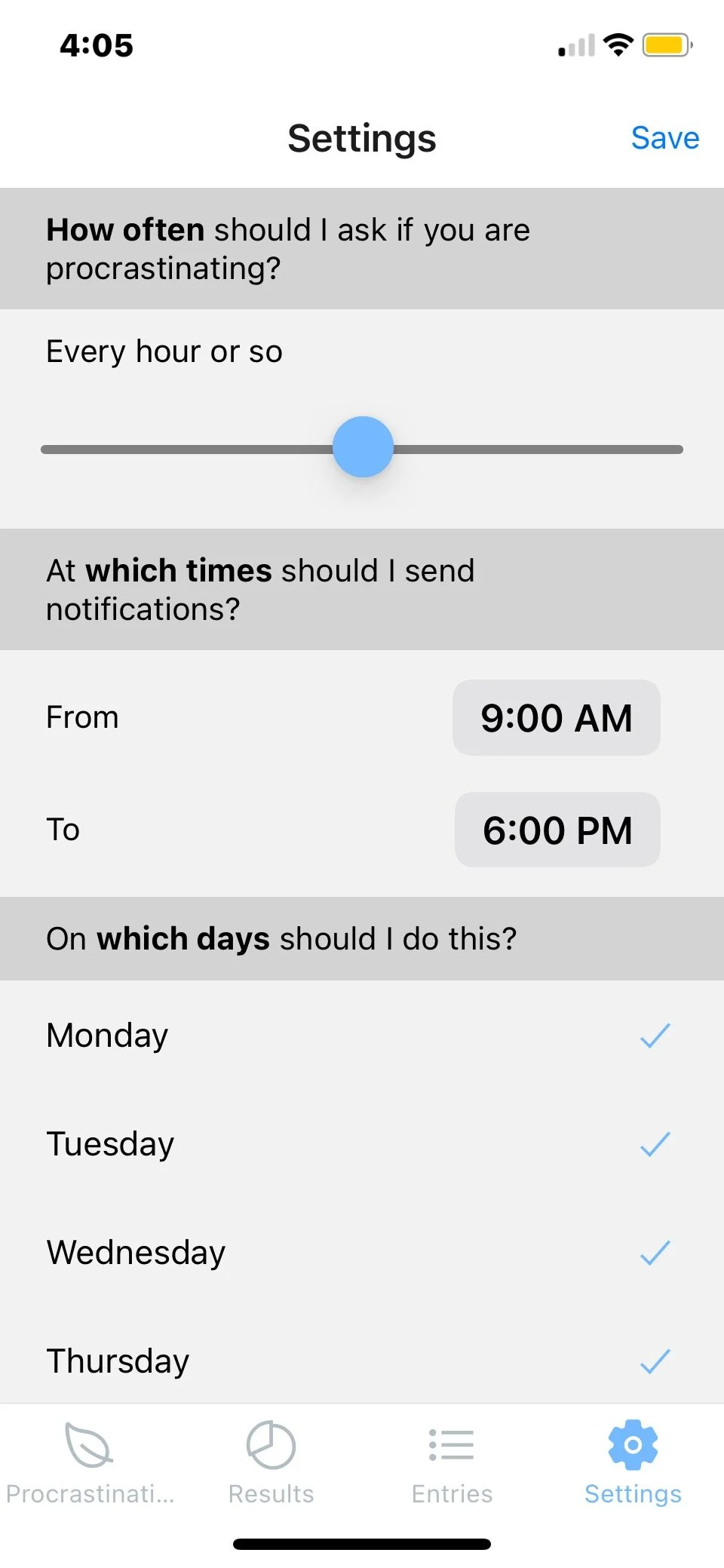
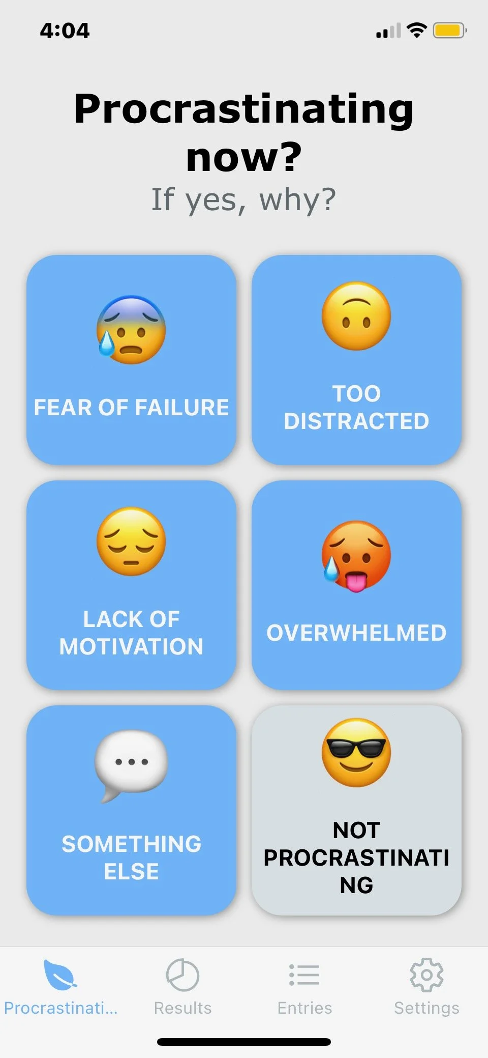
Screens and user Testing
In this video you will see some of the final designed screens which are prototyped so the user can click through and eventually complete a set task. While this is all prototyping these designs can be INCORPORATED into a mobile app or site through the use of website builder such as squarespace, shopify, wix, etc..
IA and User Flows
-
IA
For the apps navigation and pages I wanted the majority of content to be on the lessons and results page because that is where the user is going to be spending the majority of their time. The other pages act as tools and will include various links and buttons back to the main feature which is the mind map.

-
prioritizing content
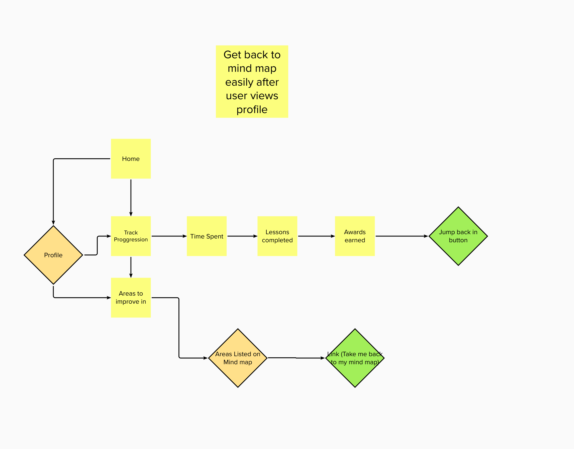
For this user goal I wanted to make it very straight forward and fluent interaction as it will be the first thing the user is doing when they open the app. The goals of this task is to keep the user engaged so they will hopefully continue on and spend more time in the app. The goal is to allow the user to perform a short task with just a few clicks and then bring them back to their lessons they may have been doing the day before so they can get the most out of the app.
-
engagement
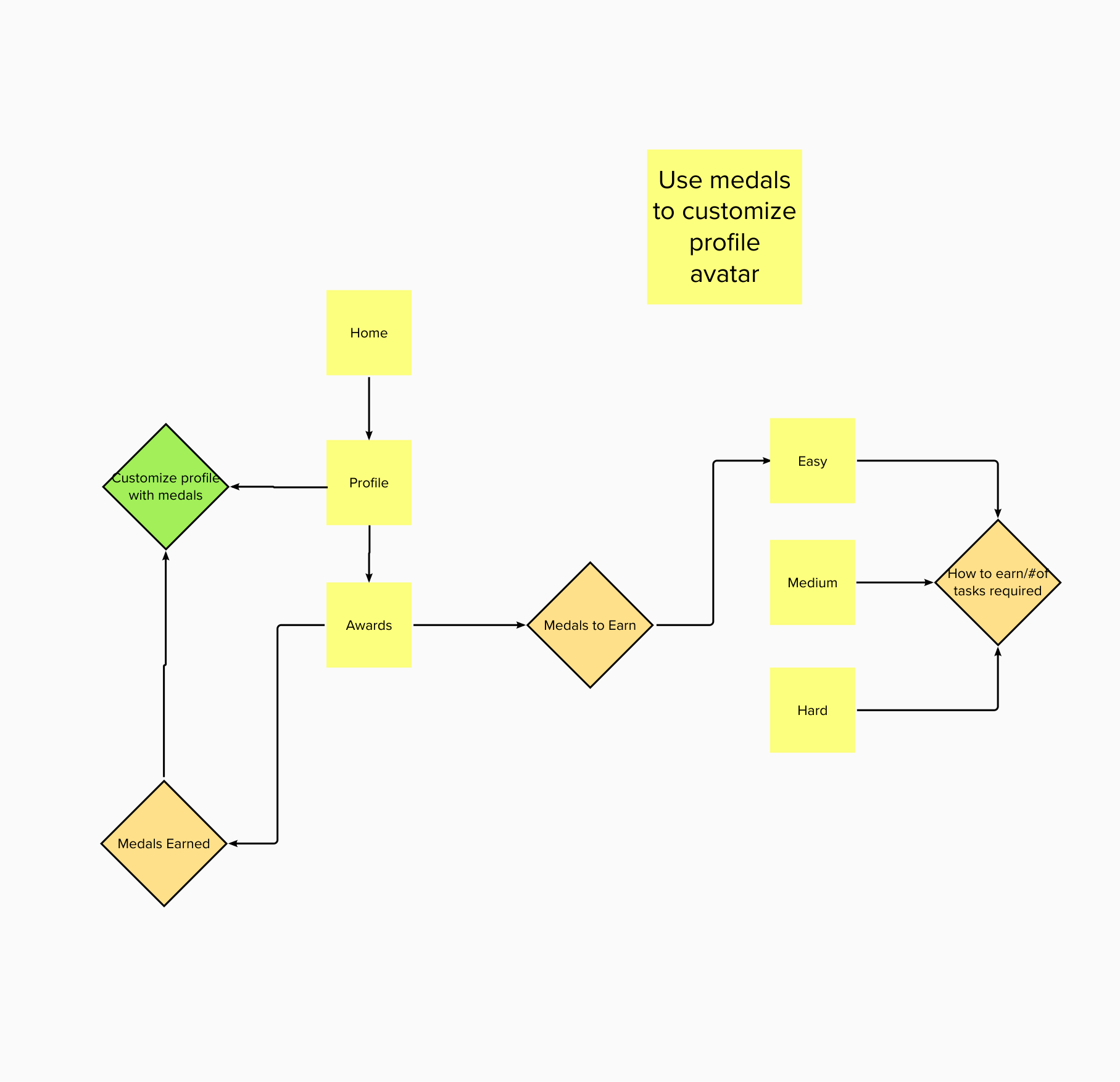
This goal is important for not only providing the user with feelings of progress through shown results but it also is a simple way for the user to personalize their profile and feel motivated to want to earn more rewards. When the user clicks on their profile the goal is to get them to feel satisfied with their growth, but also push them to keep going.
-
personalization
The goal of this task is to also make the user feel that the app is unique to them and their struggles. In the Don’t Waste Today app we want the user to feel like they are heard or being listened to. By allowing the user to create a new activity or create a random one it opens up a whole new area of curiosity when the mind map starts to feel too repetitive.

-
immediate feedback
For this user goal I wanted to make it very straight forward and fluent interaction as it will be the first thing the user is doing when they open the app. The goals of this task is to keep the user engaged so they will hopefully continue on and spend more time in the app. The goal is to allow the user to perform a short task with just a few clicks and then bring them back to their lessons they may have been doing the day before so they can get the most out of the app.

-
easy interactions
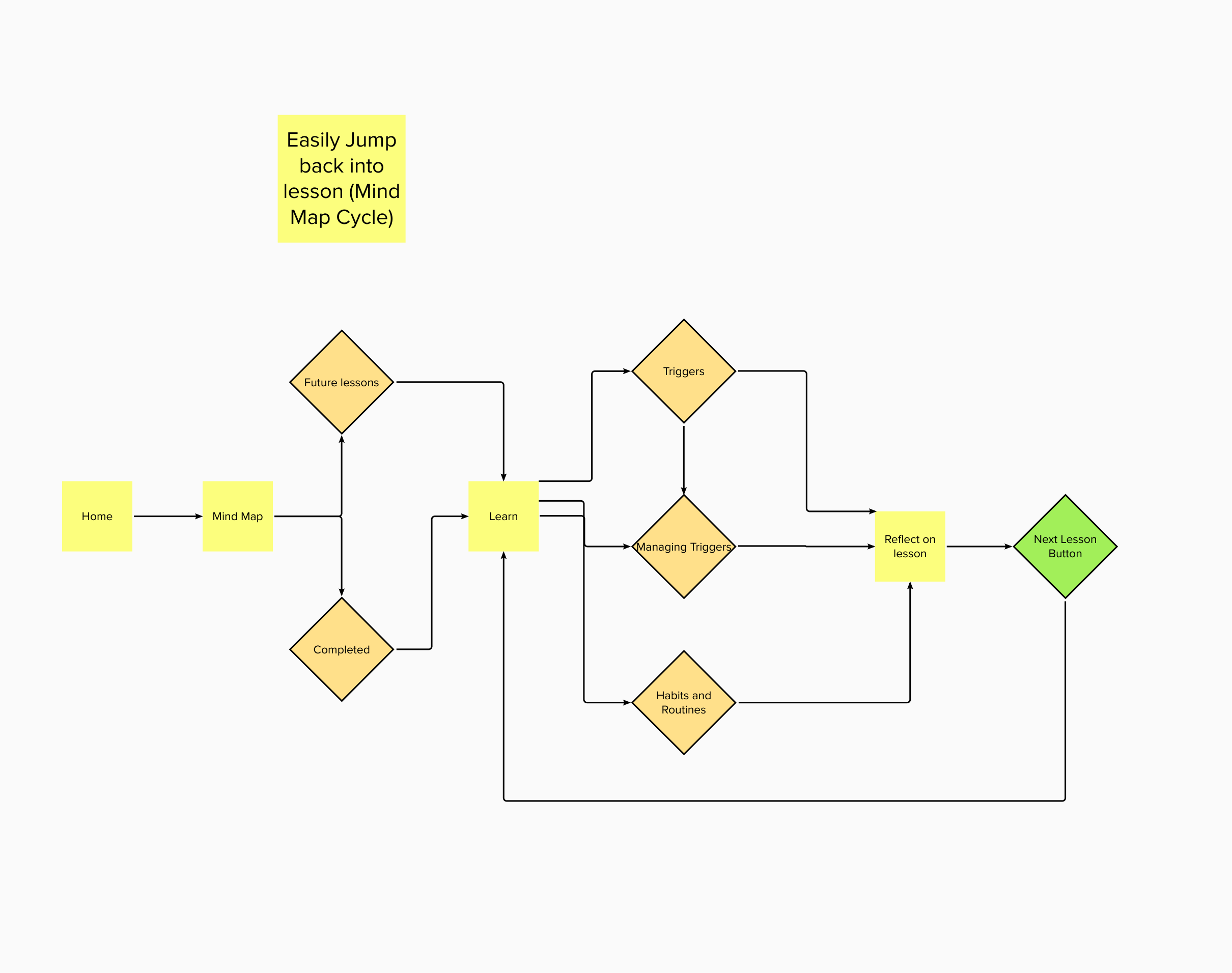
This is one of the more complicated tasks from a flow chart perspective but once in the app it will be easy to narrow down what the user is looking for with just a few clicks. The mind map feature is basically the core of the app where the user will get the most out of it, therefore we want to also incorporate a cycle in which the user once a lesson is completed can jump right back into the next lesson with an easy click of a button. This will hopefully keep the user interacting with the mind map feature.
user personas (stakeholders)
-

Chloe
Chloe is a high school student who struggles from a history of anxiety and self-doubt. Although very successful she struggles to reach her full potential because of these mental challenges. She downloaded Don’t Waste Today to feel less overwhelmed, but also so she can overcome her challenges with the use of the tools feature. Typically she plans to use the app periodically throughout the day to motivate herself and feel productive.
-

Jacob
Jacob is a doctor and scientist for cancer patients. While working endless hours in and out of labs he has realized that he is extremely unorganized. Rather than trying to unscramble all of his plans and thoughts in his head he chose to download Don’t Waste. Today so he could better organize and plan out his busy days. Jacob prefers to use the app in the mornings to plan out and kick off his day.
-

Brian
Brian is a college student who constantly is on his phone watching youtube and scrolling on social media rather than doing his work, instead he can’t help but do it at the very last minute. After receiving some harsh grades on his final he decided to download Don’t Waste Today on his mobile device to help him learn tools and ways to overcome procrastination. He plans on using the app later in the day right after his classes so he is then motivated to do his homework.
Inspiration and further research
-
Consistency Across Pages
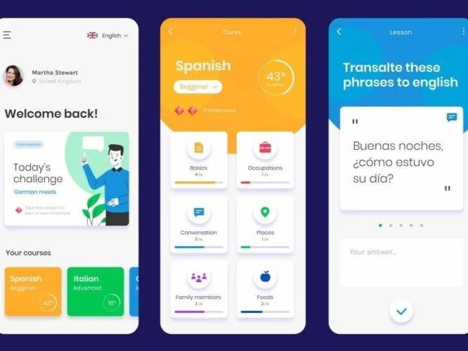
For the Don’t Waste Today app one of the first weaknesses I noticed was that the app icon has a cartoony animated feel to it, however when you open the app the mobile content within the app looks nothing like it and shows almost no resemblance. This example shown above used the colorful and animated feel which I believe the Don’t Waste Today app is trying to do but is struggling and lacking consistency across. multiple pages.
-
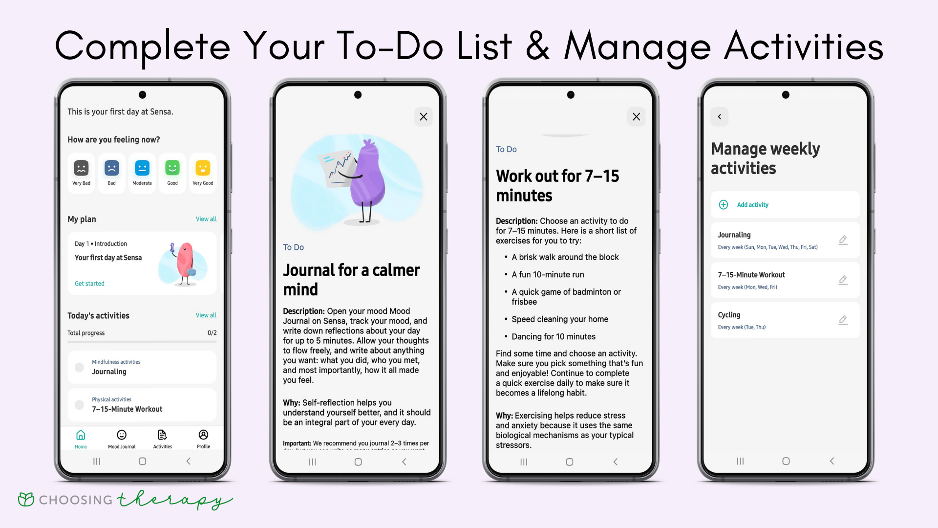
Tasks Page
One thing the Don’t Waste Today app has is a tools feature, however it does not really look that great visually and it can be a bit confusing even though there is such little content. For the tasks we will have reflective exercises based on the results as well as after the user completes their daily feeling report.
-

Don’t use various distracting colors
For redesigning this app I strongly believe a new color pallet is needed. The colors I were thinking were black, light grey and blue. This will allow the user connect more with the app and get a sense of branding. I chose black grey and blue because black and grey can be very useful when paired with a standout color like blue.
-

Results Page
Another feature that should be implemented into this app is a results page. This will track important tasks vs. less important tasks and how long the user took to complete them. This will not only show the user if they are making progress, but also us as UX designers.
-

Achievement Feature
We want the user to experience some of achievement for their own personal growth but also so they continue to revisit the app an a weekly or even daily basis.
-
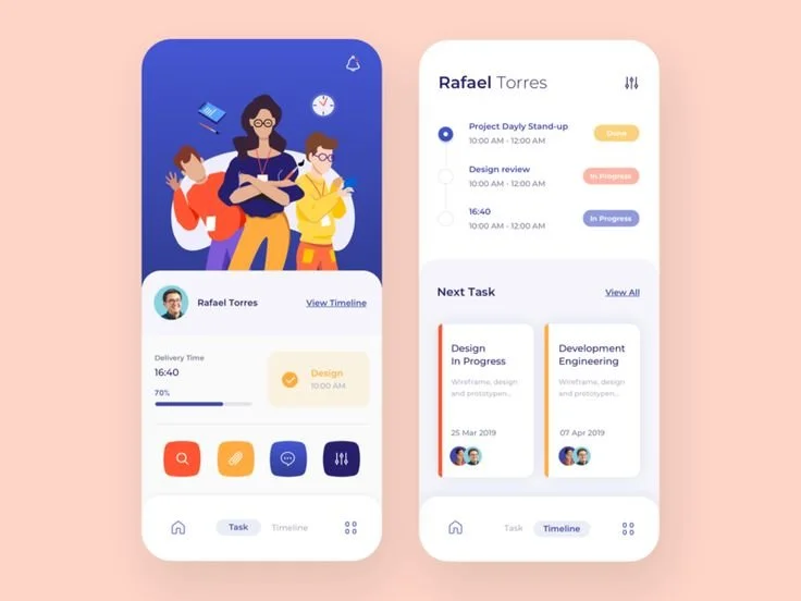
Scheduling Feature
One thing Don’t Waste Today did not have before was a schedule feature. Overall I see this as a necessary element so that the can plan out tasks they need to get done. Also to receive multiple alerts if they continue to procrastinate. Lastly we believe this would be a great feature for staying organized.
Success Metrics
